
I am generally of a grumpy disposition. There are a few things online that make me even grumpier than my normal state of somewhat contented curmudgeonliness, and among them are infographics and top x lists. With more than a touch of hyperbole, these two things represent infantilization of internet users and utter pointlessness of some so-called creative output, swamping the web with a never-ceasing diarrhoea of half-digested factoids.
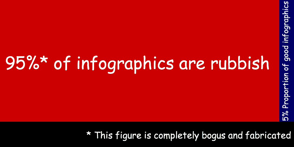
My diatribe is directed towards meaningless infographics, constituting unfortunately the majority of them that I encounter and taking up a huge amount of screen space as I surf the web, where there seems to be no convincing or rational reason for presenting the information in a visual format. Surely we have not collectively become so moronic, so cretinous, and devoid of any cognitive powers as not to be able to comprehend information expressed by the medium of written words in sentences or bullet points? Why not a simple pie chart or a line graph when there is a need? Why the need for some blobs to represent human beings or various shapes representing who knows what? Sometimes the information is so thin, expressible and be understood in a matter of few lines, but that simply shan’t do, and as such infographics must be deployed to disguise the meagreness.
If infographics in my view are often uselessly padded-up way of imparting information, the top x lists are regularly regurgitation of oft-vomited pieces of information, sometimes accompanied by inane infographics. Again, there are good lists, supported by data and compiled by those with specialist knowledge, but in many cases these lists are created by a random person, who stitched up loosely-related pieces of information in a few minutes fooling around Google. The underlying principle seems to be that anything will do, so long as they attract visitors to their site. Lists often tout the funniest, most beautiful, etc, without stating by whom and on what criteria, except the whim of the person compiling it, as if that person has such a refined sense of humour and aesthetics to come up with such lists that will meet universal acclaim.
I cannot and do not deny the fact that visual cues can present complex information in a more readily comprehensible manner and I am all in favour of it. Also lists that hierarchize things according to import have tremendous uses. Yet many of the infographics and top x lists are not created to enlighten or to communicate complex ideas, but essentially a packaging exercise, and sometimes deforming the information. The purpose is to flash a bit of colour and shape to catch attention, as if we are a bunch of toddlers, or to list an arbitrary number of things, as if we cannot judge relative importance without the help of someone ranking things. It sometimes feels as if the creators have only contempt towards the audience, as if people need big images or numbered lists in order to process information, and that the typical person has the attention span of a peculiarly forgetful goldfish.
Despite my ranting and raving, infographics and top x lists will probably be around for some time to come.